
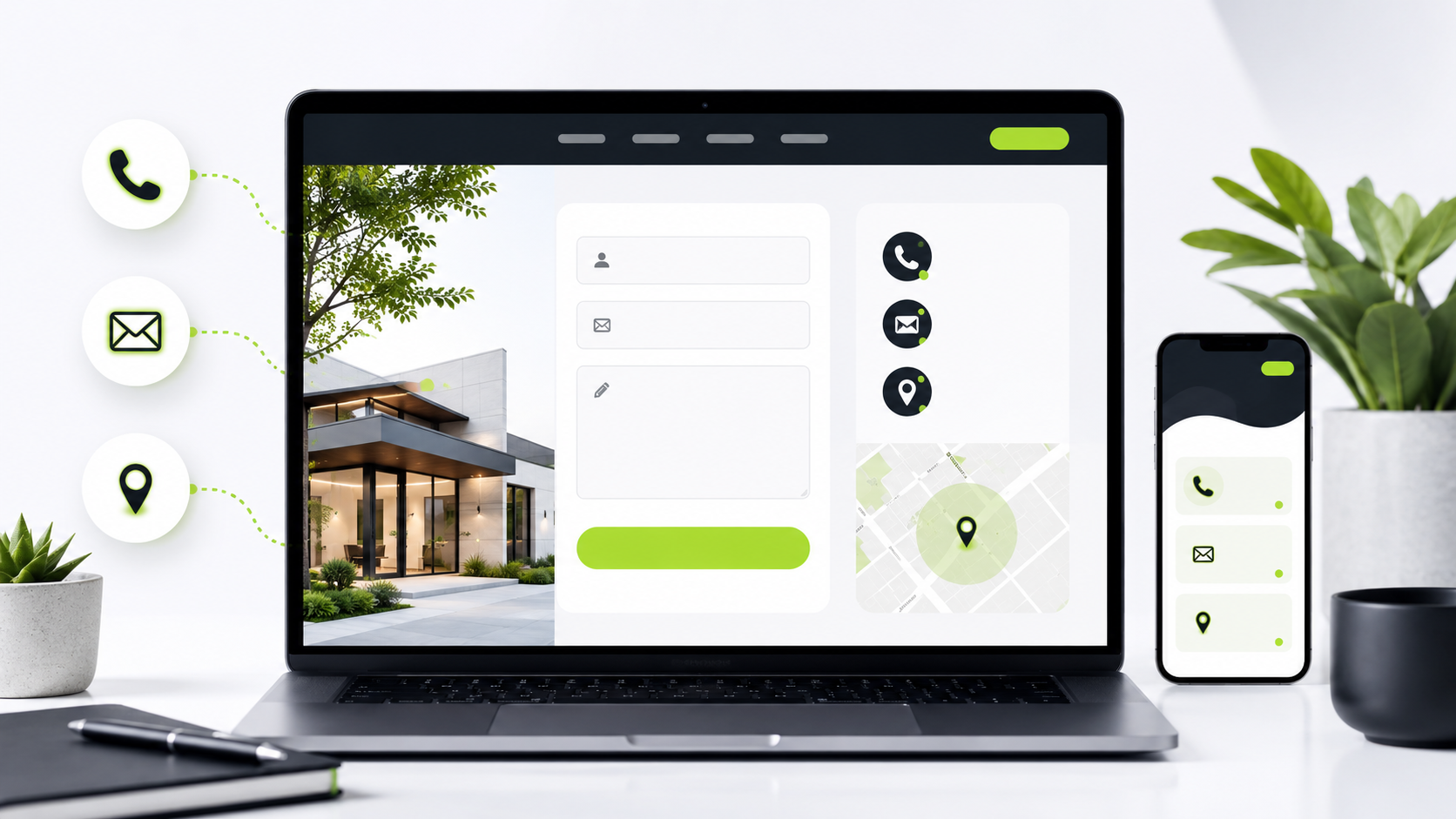
Why Your Website Should Make It Easy for Customers to Contact You
Your website should do more than look good. It should help visitors take the next step.
For many small businesses, that next step is simple: getting a customer to call, message, request a quote, schedule a service, or ask a question. If people have to search too hard for your contact information, there is a good chance they will leave and move on to another business.
A clear contact path can make a big difference.
Every Page Should Guide Visitors Toward Action
Not every visitor starts on your homepage. Some may land on a service page, blog post, product page, or portfolio page. That means every page should make it clear what the visitor can do next.
A website should gently guide people toward action with buttons, links, and simple calls to action. These can include:
“Contact Us”
“Request a Quote”
“Schedule a Service”
“View Our Services”
“Send a Message”
The goal is not to pressure people. The goal is to make the next step obvious.
Contact Buttons Should Be Easy to Find
Your contact button should not be hidden at the bottom of the page or buried in a menu. Visitors should be able to find it quickly.
Good places for contact buttons include the top navigation, homepage hero section, service sections, and the footer. On mobile, it can also help to have a visible call button or contact link that is easy to tap.
If someone is ready to reach out, your website should not slow them down.
Forms Should Be Short and Simple
Contact forms are useful, but they should not feel like homework.
A simple form usually works best. In most cases, you only need the basics:
Name
Email or phone number
A short message
The service they are interested in
Long forms can scare people away, especially on mobile. Keep it simple and only ask for the information you actually need to start the conversation.
Local Businesses Should Show Service Areas
For local businesses, service areas are important. Visitors want to know if you work in their city, town, county, or neighborhood.
Adding service areas to your website helps customers quickly understand whether your business is a good fit. It can also help search engines better understand where your business operates.
For example, a lawn care company, cleaning service, contractor, or mobile detailer should clearly list the areas they serve. This builds trust and helps reduce confusion before someone contacts you.
Clear CTAs Build Confidence
A CTA, or call to action, tells visitors what to do next. Clear CTAs make your website feel more organized and professional.
Instead of vague buttons like “Learn More,” try using action-focused phrases that match what the customer wants to do.
Examples include:
“Get a Free Quote”
“Contact Us Today”
“Book a Service”
“View Website Services”
“Start Your Project”
When your website gives visitors clear direction, it makes your business feel easier to work with.
Make Contact Simple
A good website should remove friction. If a customer is interested, they should know exactly how to reach you.
Easy-to-find contact buttons, simple forms, clear service areas, and strong calls to action can help turn visitors into real leads. These small improvements can make your website more helpful, more professional, and more effective for your business.
Visit the SDS Services page to see how we can help with simple website improvements.


Comments
Some comments may be flagged by the security system and held for review.
No approved comments yet. You can be the first to join the discussion.
Leave a Comment
Your first name will be shown publicly after approval. Please keep comments respectful and on topic.