
5 Signs Your Small Business Website Needs an Update
Your website is often the first impression people get of your business. Before they call, message, visit, or buy, many customers will check your website to see who you are, what you offer, and whether they can trust you.
The problem is that many small business websites get built once and then left alone for years. Over time, the design starts to feel outdated, information becomes unclear, and visitors may leave before taking action.
Here are five signs your small business website may need an update.
- The Design Looks Outdated
Your website does not need to be flashy, but it should look clean, organized, and current. If your site feels old, crowded, hard to read, or visually inconsistent, visitors may assume your business is outdated too.
A modern website should use clear sections, readable text, strong images, and simple navigation. Even small design improvements can make your business look more professional and trustworthy.
- It Is Hard to Use on Mobile
Many customers browse websites from their phones. If your site is difficult to use on mobile, you could be losing potential leads without realizing it.
Signs of a poor mobile experience include text that is too small, buttons that are hard to tap, images that do not fit the screen, or pages that require too much zooming and scrolling. A mobile-friendly website should feel simple, fast, and easy to use on any screen size.
- Visitors Cannot Quickly Understand What You Do
When someone lands on your website, they should understand your business within a few seconds. If your homepage does not clearly explain what you do, who you help, and how to get started, visitors may leave and look somewhere else.
Your website should answer basic questions right away:
What services do you offer?
Who are those services for?
What area do you serve?
How can someone contact you or request more information?
Clear messaging helps visitors feel confident and makes it easier for them to take the next step.
- Contact Information Is Hard to Find
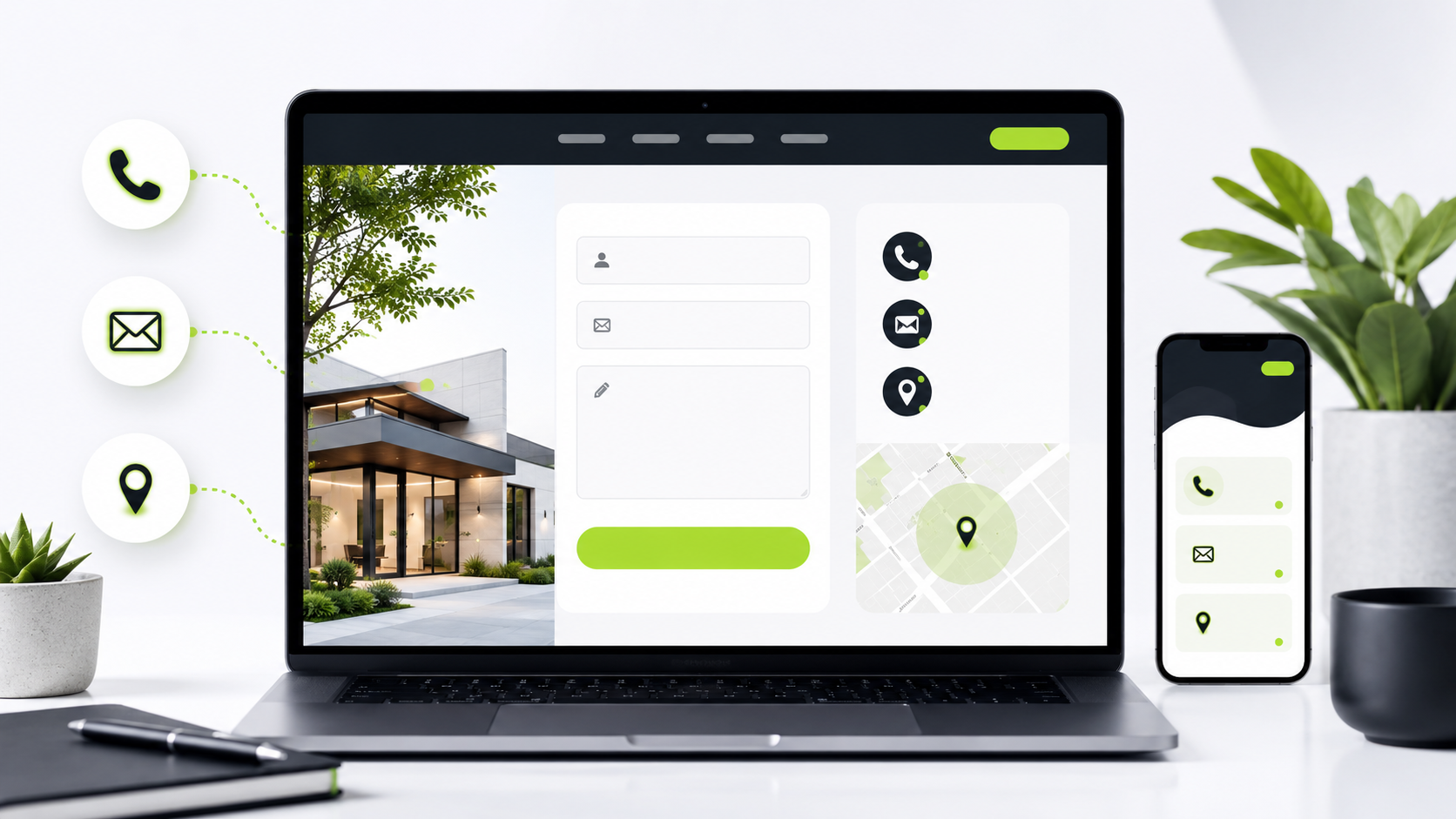
If someone is ready to reach out, your website should make that easy. Contact information should not be hidden at the bottom of a page or buried behind too many clicks.
A strong small business website should include clear ways to contact you, such as a phone number, email address, contact form, business hours, or social media links. Your call-to-action buttons should also be easy to find, especially on your homepage and service pages.
If visitors have to search too hard for your contact information, they may give up.
- Services, Prices, or Examples Are Missing or Unclear
Customers want to know what you offer before they reach out. If your services are vague, outdated, or missing important details, your website may not be doing enough to help them make a decision.
You do not always need to list exact prices, but you should give visitors enough information to understand what they can expect. Service descriptions, project examples, photos, testimonials, or package details can all help build trust.
A website that clearly shows what you do makes your business feel more reliable and easier to choose.
Final Thoughts
Your website does not have to be perfect, but it should be clear, easy to use, and helpful for your visitors. If your site looks outdated, does not work well on mobile, or makes it hard for people to understand your business, it may be time for an update.
A good website should support your business, not hold it back.
At Schmidtz Digital Studio, we help small businesses, creators, and local service providers build cleaner, more useful digital resources. Whether you need a simple website refresh, a starter template, or help organizing your online presence, a stronger website can make a big difference.
Comments
Some comments may be flagged by the security system and held for review.
No approved comments yet. You can be the first to join the discussion.
Leave a Comment
Your first name will be shown publicly after approval. Please keep comments respectful and on topic.